Access
Connect cross-platform accounts & identity management
App Editor allows you to apply changes to the view and configurations for the Launcher during runtime, meaning that no rebuild or redeployment is needed.
App Editor consists of two sections, Customization and Feature Flags:
NOTE
App Editor is currently in the early access phase so there are limitations within its features and functionalities. At the moment, it can only be used for Launcher customization with the single game template. In a future release of App Editor, we will include the ability to customize the Player Portal.
App Editor introduces template selection, allowing you to choose a template based on your requirements.
NOTE
We recommend that you don’t change the template in the middle of the customization as this could cause unexpected issues.
Permissions are used to grant access to specific resources within our services. Your account will automatically have the Super Admin role, which means that you have the following permissions for the App Editor (Customization and Feature flag) in the Admin Portal.
| Usage | Resource | Permission |
| Access and manage customization | ADMIN:NAMESPACE:{namespace}:CONFIG | Create, Read, Update, Delete |
You must set up game publishing before you can use App Editor.
NOTE
This phase only allows you to configure settings for a single game. Future phases will include multiple game settings.
Follow the steps below to configure the general settings for a single game:
In the Admin Portal, go to the App Editor section in the menu on the left.
Select Launcher. The Launcher page displays.

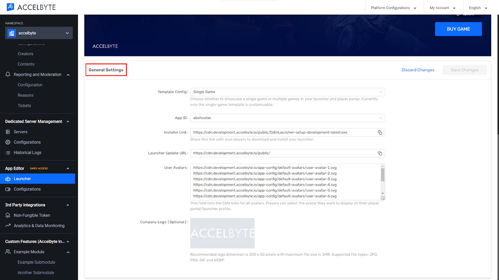
Scroll down and select General Settings.
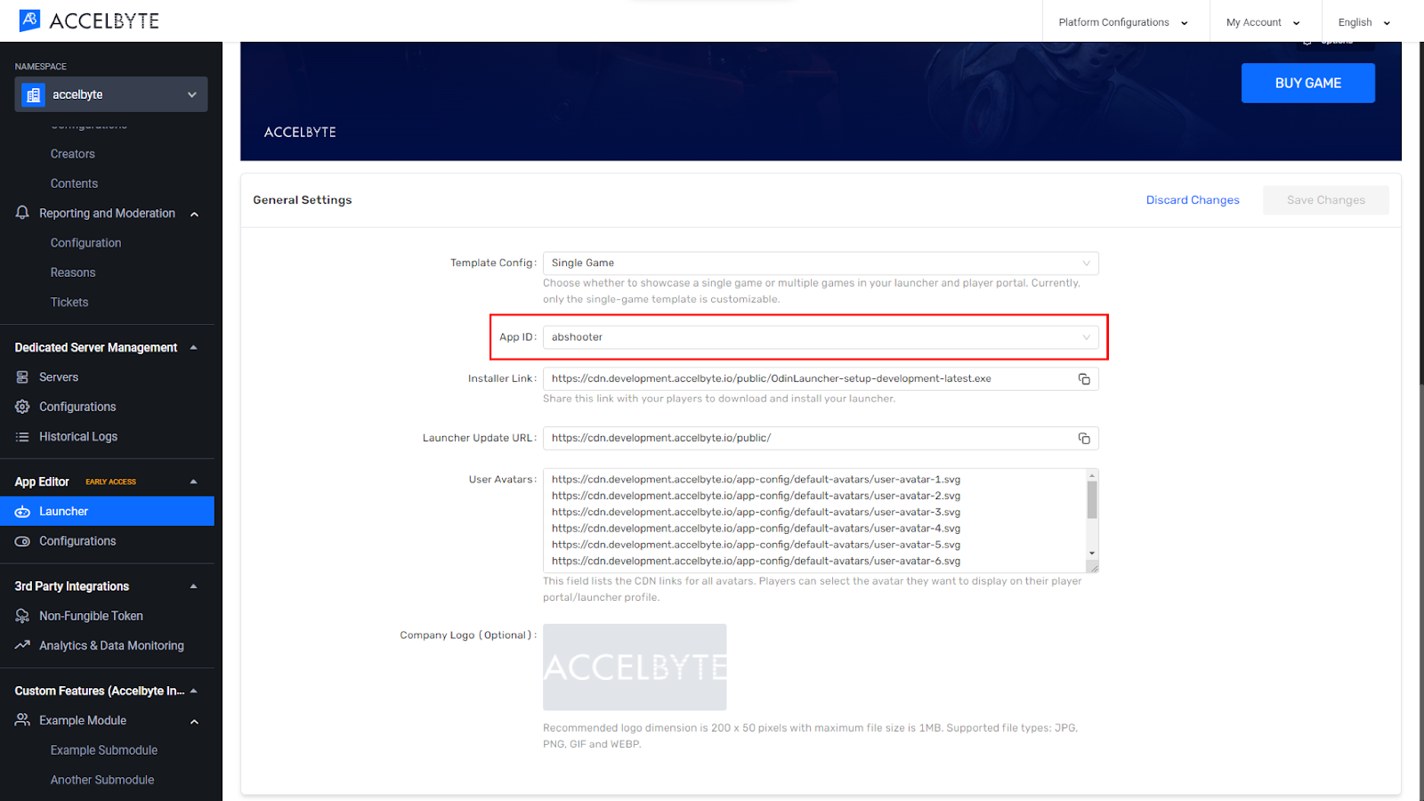
Select the App ID from the dropdown.
NOTE
The App ID field acts as a bridge between the uploaded game binary and the Launcher itself. App Editor uses it to configure which App ID the user wants to use. If you do not select the App ID, the Launcher will not show any contents.
The fields Installer Link, Launcher Update URL, and User Avatars are filled by default. You can ignore them.
Upload your company logo, if you wish (this is optional).
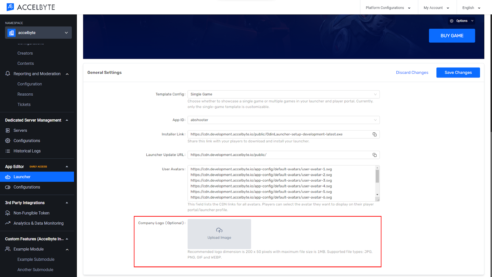
When you’re done, click Save Changes.
In the Admin Portal, go to the App Editor section in the menu on the left.
Select Launcher. The Launcher page displays.
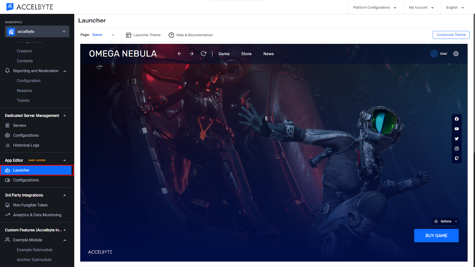
Choose the Launcher Theme.
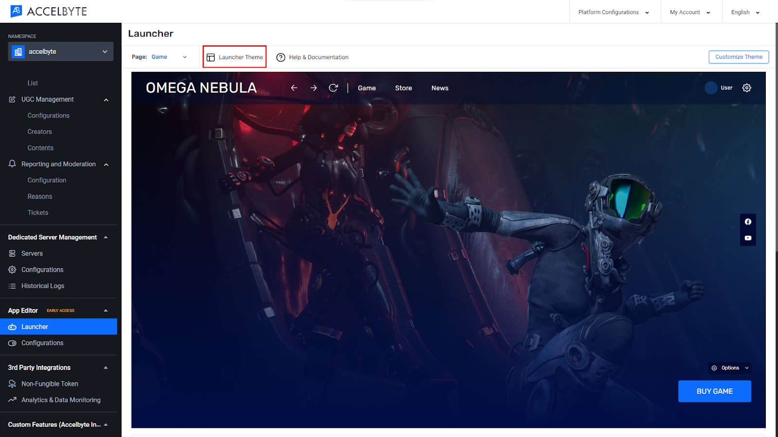
Click on one of the pre-made themes to select it.
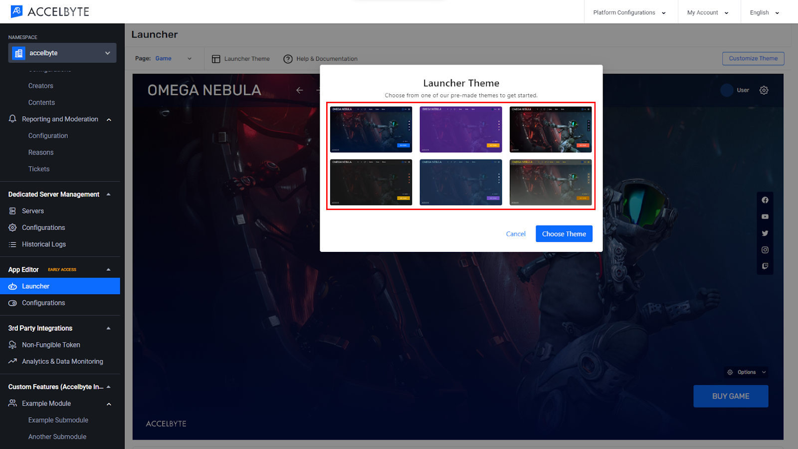
When you’re done, click Choose Theme.
Customizing a theme will update the look and feel of the Launcher. You can customize the global styles and content on each page. A preview screen will show the result of any changes you make.
There are two ways to publish the changes you make to a theme:
NOTE
The Autosave feature is set to save your theme to the browser's local storage every five minutes.
Global styles are the colors and fonts used throughout the Launcher. You can change these to suit your own style.
You can use the Global Colors feature to apply a new color to the components on multiple pages at once. In addition to streamlining your workflow, the Global Colors feature also helps you to make sure that your Launcher has a consistent color scheme on all components such as buttons, inputs, backgrounds, etc.
You can change the global colors for the components listed in the tables below:
| Buttons | |
|---|---|
| Primary button | Default state Button background: Primary Color Button text: Text Color Hover/active/pressed state Button background: Primary Color, Brightness: 85% Button text: Text Color, Brightness: 85% Disabled state (non-editable colors) Button background: #687792 Button text: #B8BFCD |
| Outlined button | Default state Button outline: Text Color Button text: Text Color Hover/active/pressed state Button outline: Text Color, Brightness: 85% Button text: Text Color, Brightness: 85% Disabled state (non-editable colors) Button outline: #687792 Button text: #687792 |
| Ghost button | Default state Button background: Text Color, Transparency: 0 Button text: Text Color Hover/active/pressed state Button background: Text Color, Transparency: 0.2 Button text: Text Color, Brightness: 85% Disabled state (non-editable colors) Button background: #687792, Transparency: 0.2 Button text: #687792 |
| Input | |
|---|---|
| Text field | Default state Label: Text Color Input background: Background Color Input outline: Text Color, Transparency: 0.65 Input placeholder: Text Color, Transparency: 0.45 Focused state Label: Text Color Input background: Background Color Input outline: Primary Color Input text: Text Color, Transparency: 0.45 Filled state Label: Text Color Input background: Background Color Input outline: Text Color Input text: Text Color Disabled state (non-editable colors) Label: #687792 Input background: #232831 Input outline: #687792 Input text: #4C576B Error state (partly non-editable colors) Label: Text Color Input background: Background Color Input outline: #FF5252 Input text: Text Color Helper text: #FF5252 |
| Checkbox, radio, and toggle | Default/inactive state Label: Text Color Input background: Text Color Hover state Label: Text Color Input background: Text Color Input outline: Primary Color Active/selected state Label: Text Color Input background: Text Color Input active: Primary Color Input outline: Primary Color Disabled state (non-editable colors) Label: #687792 Input background: #232831 Input active: #4C576B Input outline: #687792 |
| Dropdown list | Default state Text: Text Color Icons: Text Color Background: Text Color, Transparency: 0 Hover/active/pressed state Text: Text Color Icons: Text Color Background: Primary Color Disabled state (non-editable colors) Text: #687792 Icons: #687792 Background: N/A |
| Top navigation bar | |
|---|---|
| Navbar background | Background Color, Transparency: 0.65 |
| Navbar contents | Default state Text: Text Color Icons: Text Color Hover state Text: Text Color, Transparency: 0.65 Icons: Text Color, Transparency: 0.65 Disabled state (non-editable colors) Text: #687792 Icons: #687792 |
| Elevated components | |
|---|---|
| Modal background | Modal and Card Color |
| Card background | Modal and Card Color |
| Dropdown | Background: Modal and Card Color Background outline: Overlay Color |
| Tooltip background | Modal and Card Color |
| Modal background | Modal and Card Color |
| Download components | |
|---|---|
| Download bar | Active state Label: Text Color Completed bar: Primary Color Uncompleted bar: Text Color, Transparency: 0.65 Download information texts: Text Color Paused state Label: Text Color Completed bar: #687792 Uncompleted bar: Text Color, Transparency: 0.65 Download information texts: Text Color |
| Social links | |
|---|---|
| Social icons | Default state Icon: Secondary Color Background: Overlay Color Hover/selected state Icon: Secondary Color, Brightness: 85% Background: Overlay Color Label: Text Color, Transparency: 0.65 |
| Background | |
|---|---|
| Background | Background Color |
| Overlays | Overlay Color, Transparency: 0.85 |
The following steps will guide you through changing the global colors:
In the Admin Portal, go to the App Editor section in the menu on the left.
Select Launcher. The Launcher page displays.

Click Customize Theme.
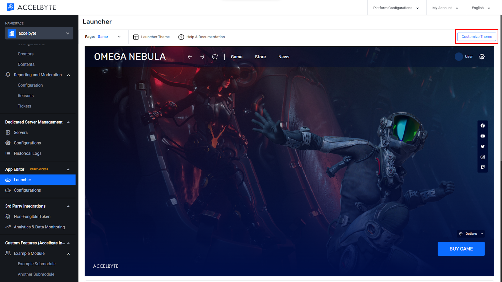
In the Customize Theme menu, go to the Global Styles section.
Update the Global Colors based on your preferences and which area you’d like to change.
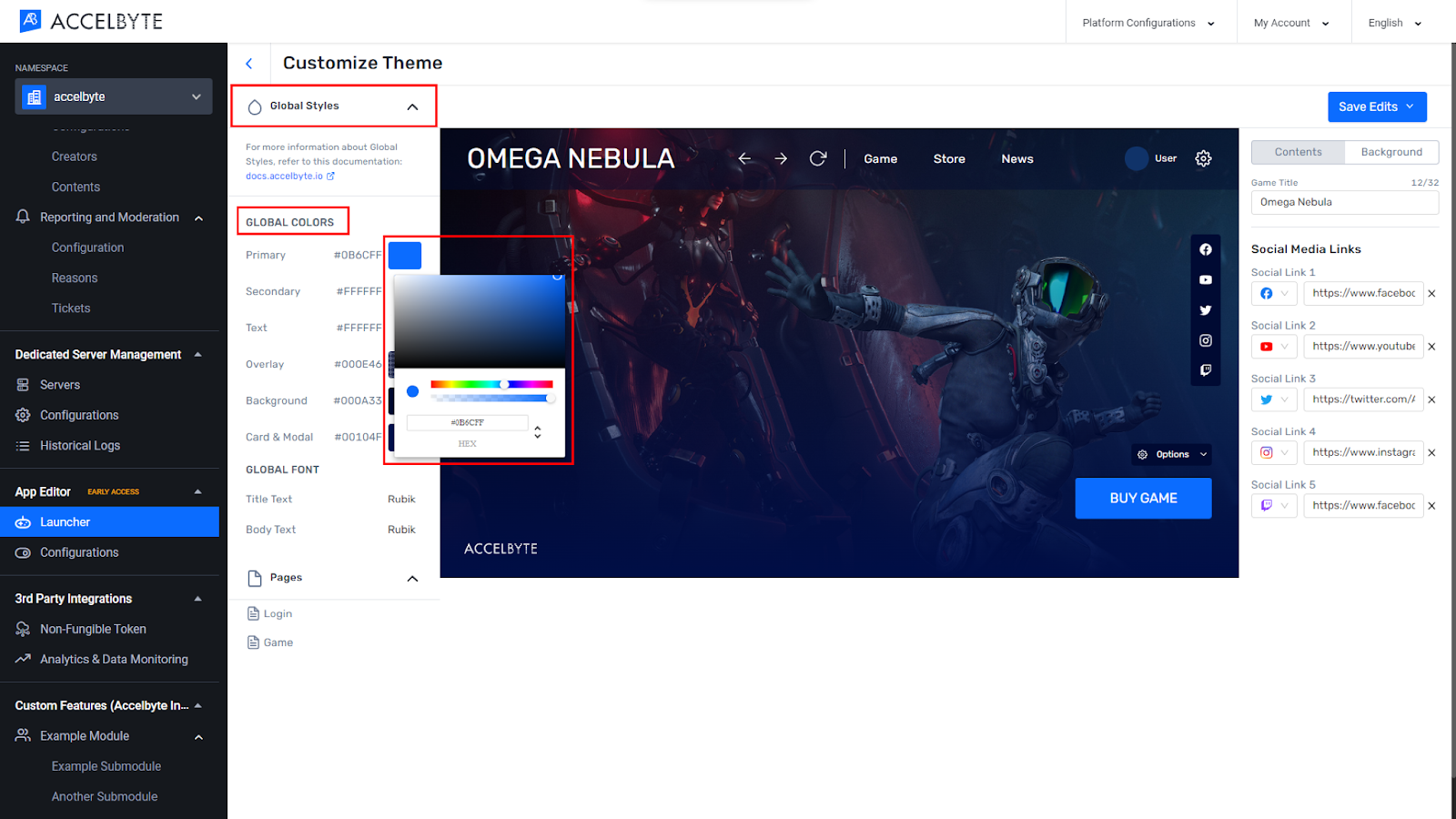
Click Save Edits.
Click Save & Publish.

Follow the steps below to set the global font:
In the Admin Portal, go to the App Editor section in the menu on the left.
Select Launcher. The Launcher page displays.

Click Customize Theme.

In the Customize Theme menu, go to the Global Styles section.
Update the Global Font items based on your preferences.
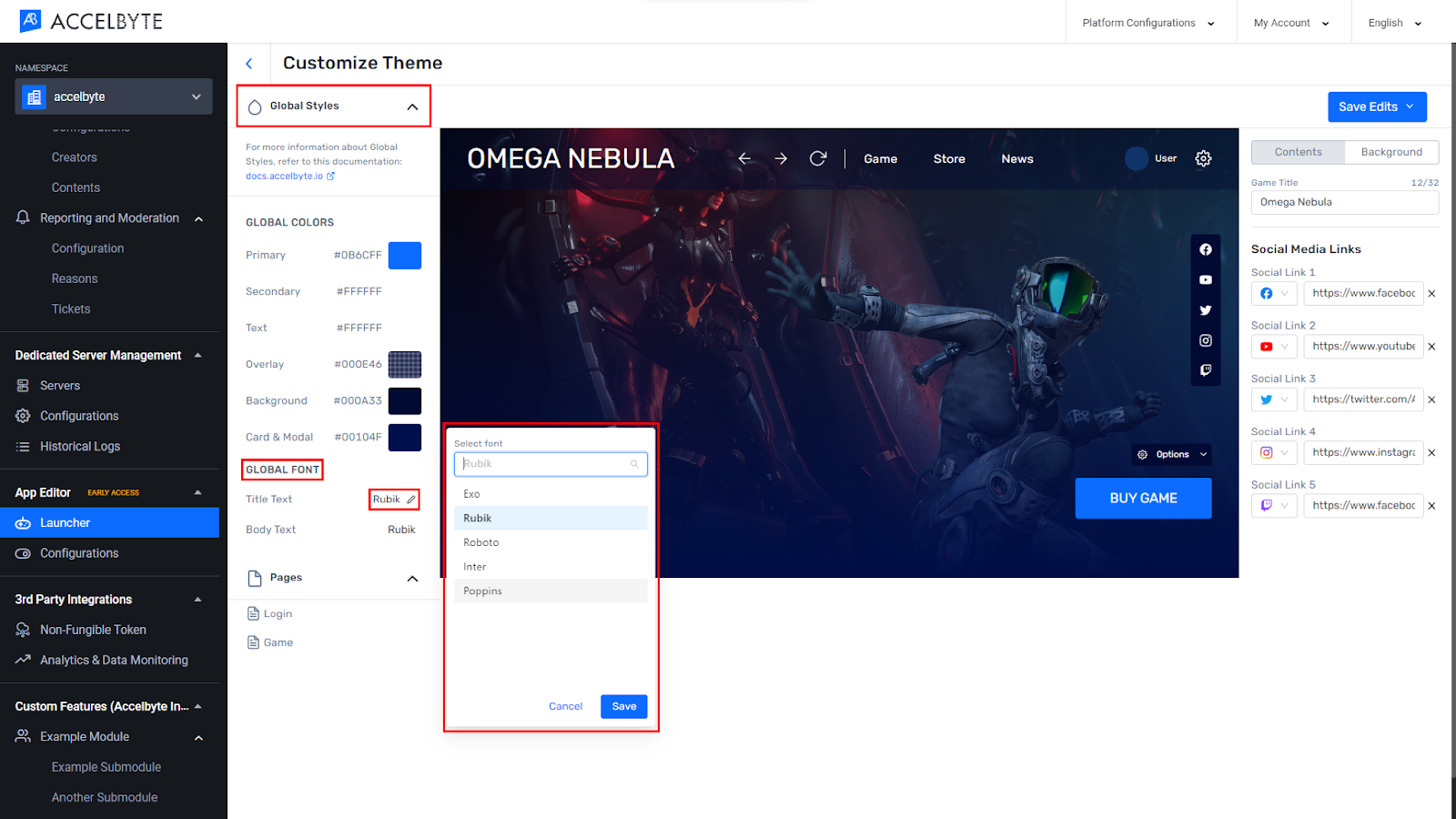
Click Save Edits.
Click Save & Publish.

Customizing content is used to customize a specific area which only exists in each menu. At the moment only two pages can be customized, the Login page and the Game page.
Use the steps below to customize the Login page:
In the Admin Portal, go to the App Editor section in the menu on the left.
Select Launcher. The Launcher page displays.

Click Customize Theme.

In the Customize Theme menu, go to the Global Styles section.
Choose Pages then Login.
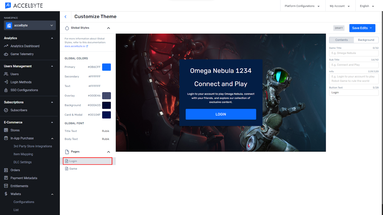
On the right sidebar, edit the content based on your preferences.
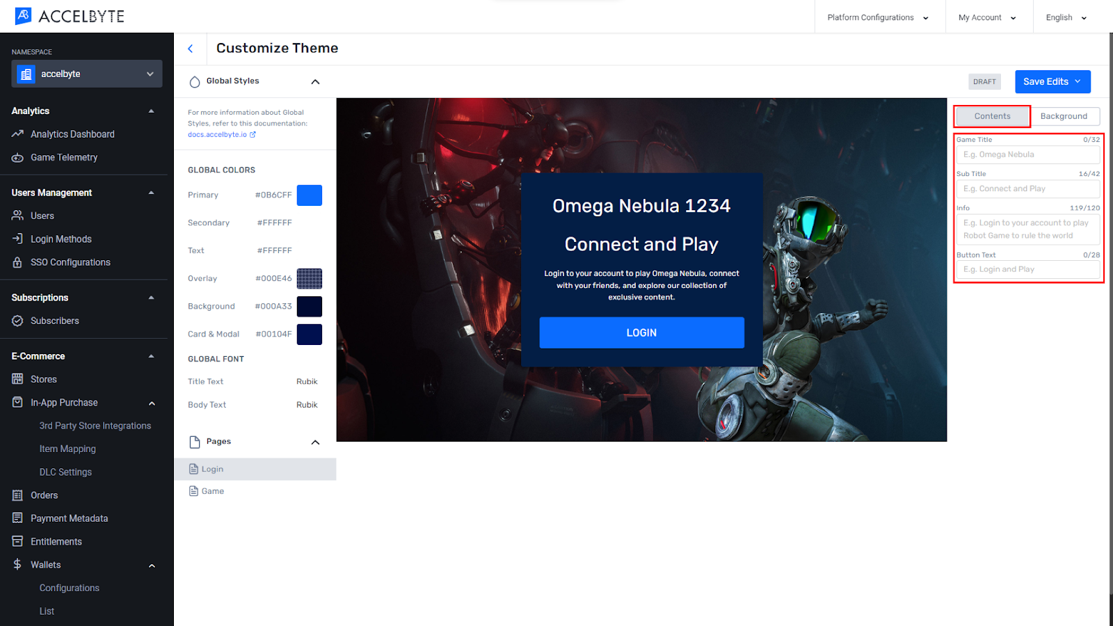
Click the Background tab.
Upload a background image and adjust the gradient based on your preferences.

When you’re done, click Save Edits then click Save & Publish.

The following steps guide you through customizing the Game page:
In the Admin Portal, go to the App Editor section in the menu on the left.
Select Launcher. The Launcher page displays.

Click Customize theme.

In the Select Styles menu, choose Pages then Game.
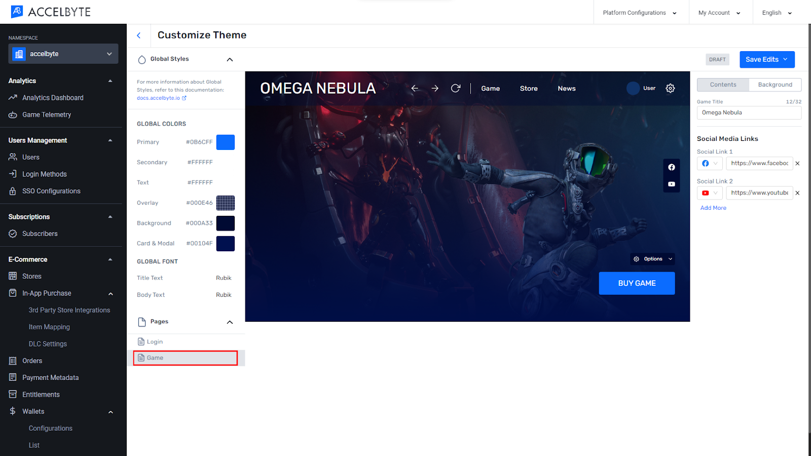
In the Social Media Links menu on the right, click Add More.
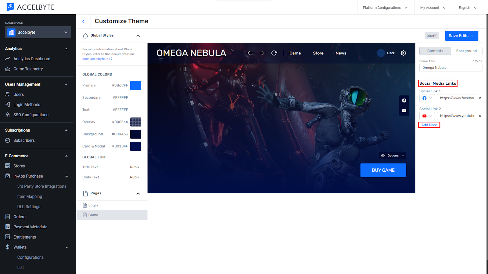
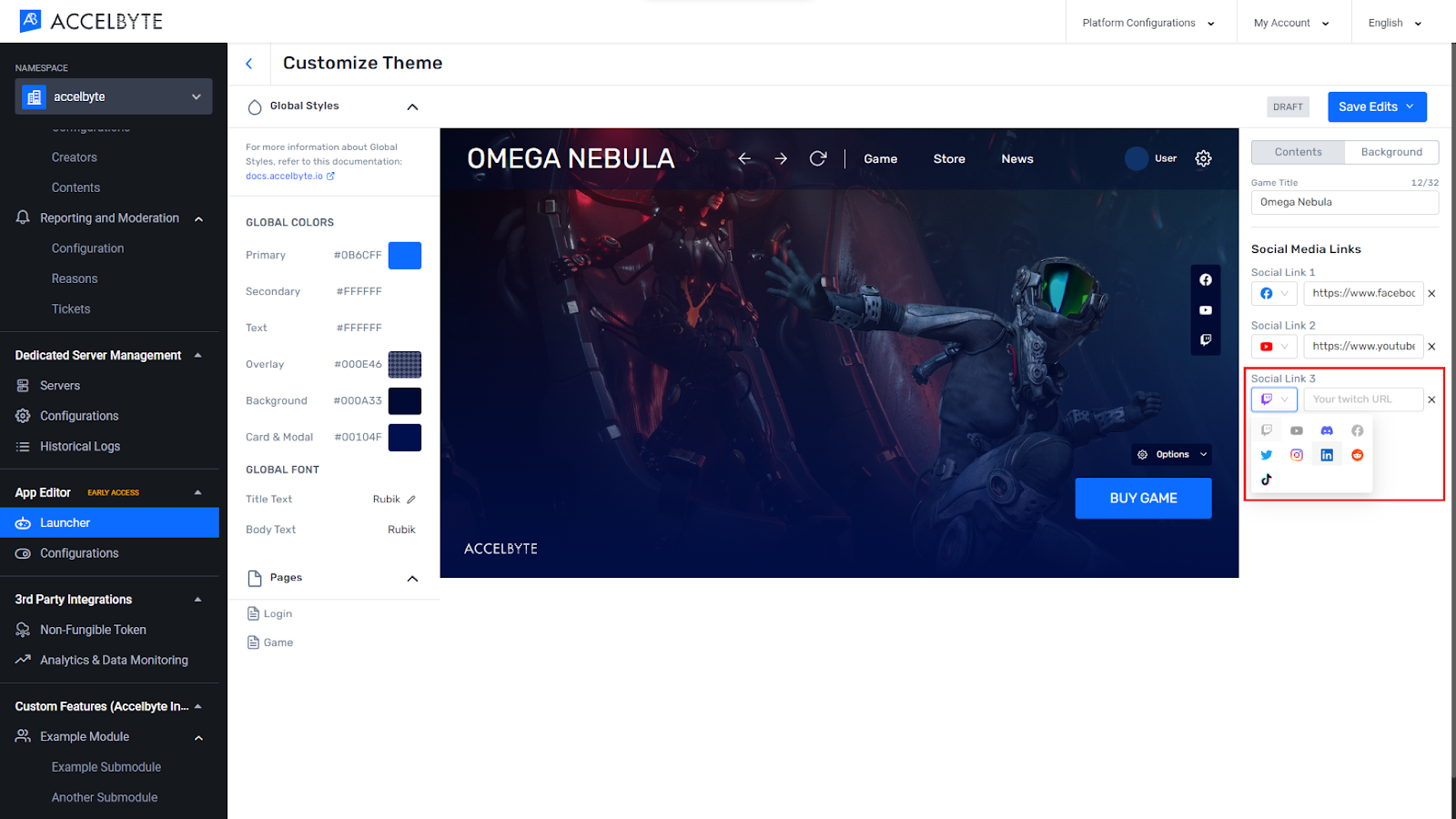
Choose the social media that you’d like to add, then add the URL.
Click the icon of the selected social media.
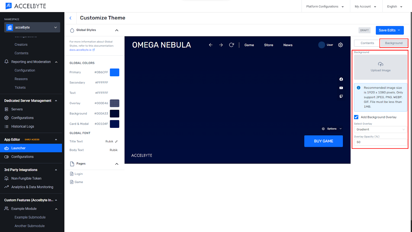
Click the Background tab.
Upload a background image and adjust the gradient based on your preferences.
To change or remove the background image, click Replace Image or Remove Image in the upload image panel.
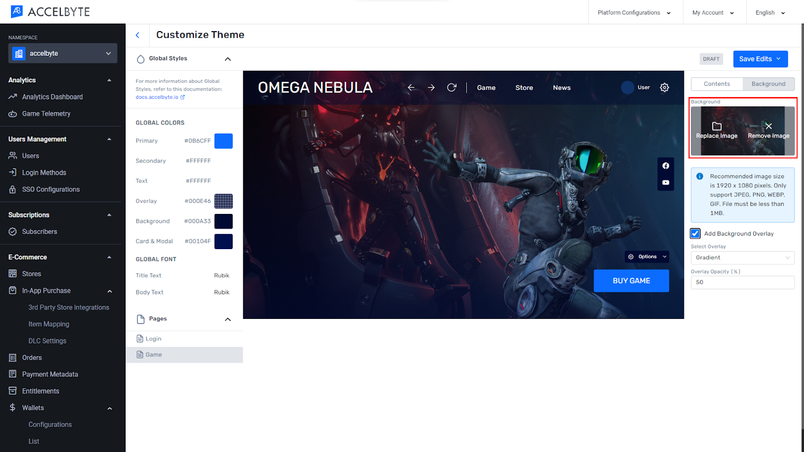
When you’re done, click Save Edits then click Save & Publish.
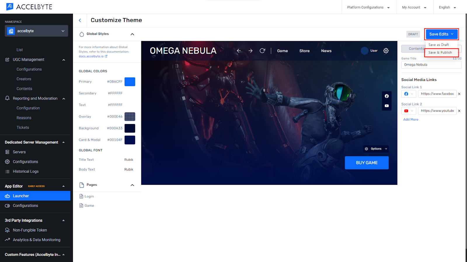
NOTE
You can set a maximum of five social media options. Adding a background overlay is optional; you can either add it by ticking the option or un-ticking it if it’s not needed.
Feature flags can be used in both the Launcher and Player Portal and allow you to disable certain features with a single switch. The tool itself consists of two sections, App flags and Experimental flags.
Make changes to the App flags as follows:
In the Admin Portal, go to the App Editor section in the menu on the left.
Select Configuration. The Configuration page displays.
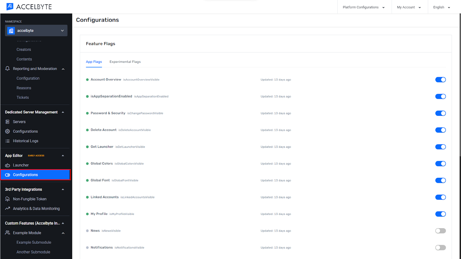
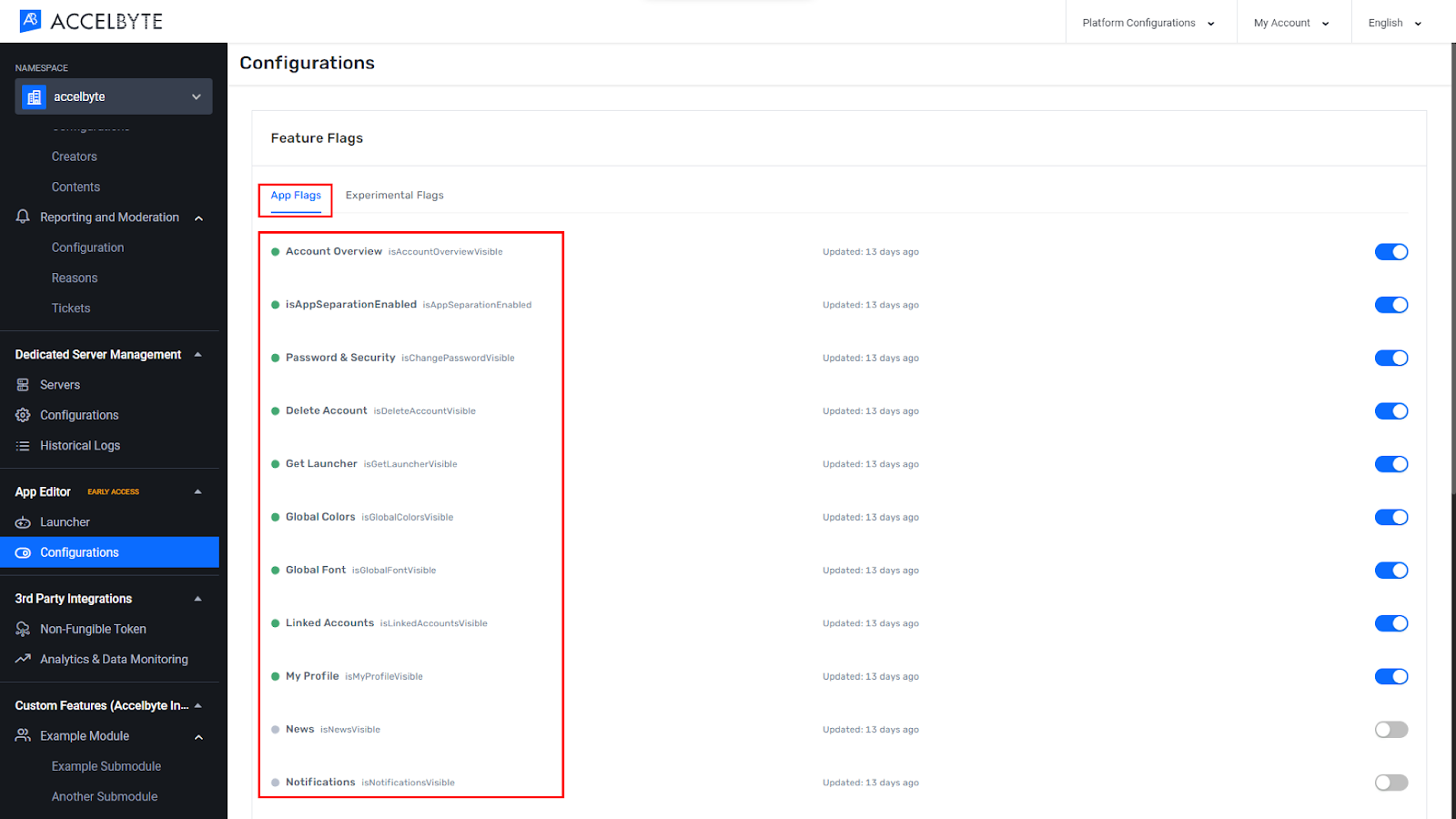
In the App flags menu, find the feature that you want to flag.
Click the toggle from ON to OFF.
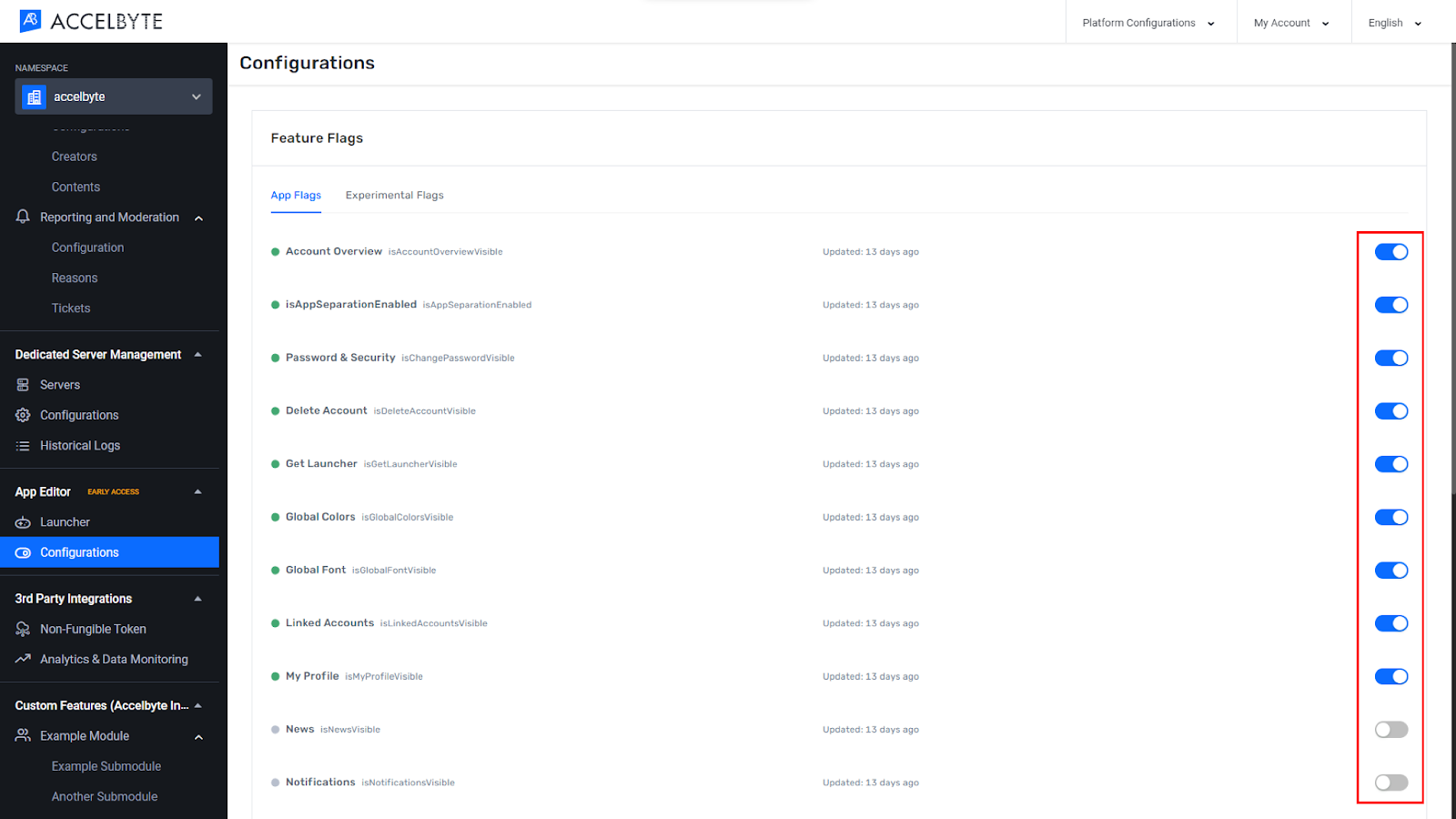
To make it visible again, switch the toggle from OFF to ON.
When you’re done, refresh the Launcher or Player Portal in order to see the changes.